20 Sep 2021 Making sense out of chaos
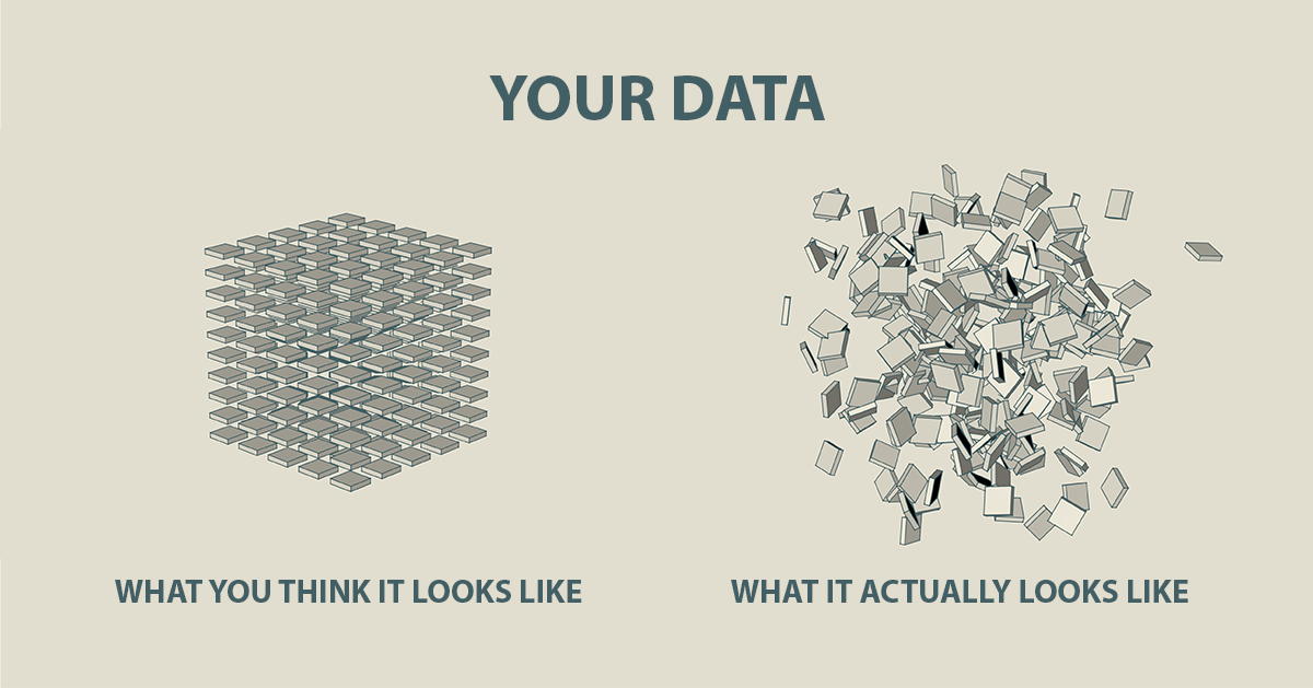
What do you think your data looks like? You probably imagine something orderly especially if it is reasonably well maintained. You might envisage a complete set of data – structured, tidy, straight lines, no holes, ready to be “sliced and diced”, mined from an imaginary lake in a cloud – whatever that might mean.
But your data probably doesn’t look quite like that.
Cubes, lakes and clouds are perfectly good metaphors for the way data should look but in reality – especially when it comes to spend data – it’s a constantly changing landscape, it’s not uniform and it isn’t always user friendly. It is almost certainly not for sharing without some interpretation.
It’s not good to have holes in your data but it not natural to have none
I’m not referring to dirty data. Even good, clean data reflects the uneven and imperfect world that we work in. It’s not good to have holes in your data but it not natural to have none. Uneven data can be difficult to read but perfectly straight lines only exist in theory. Your data should be an accurate reflection of the reality within which your organisation operates – which is often messy. It’s never precise and it doesn’t fit into a neat, regular shaped box.

Dashboard or diagnostics – how much detail do you need
Too many KPI dashboards have too much information. It’s as though people feel that because they know it, they have to share it. Like showing your workings in a mathematics exam to demonstrate you understand where the answer came from – in a dashboard, you just need the answers and as few and as relevant as possible. Knowing how many requisitions Charlie in Farnborough raised might be important for his line manager but it’s not going to alter the strategic direction of a global business.
“Keep It Simple Stupid” isn’t just a rule to make life easy. If you can’t present complex issues in simple terms, there’d a good chance you don’t really understand them. The dashboard audience doesn’t want or need the detail – they need simplicity and clarity. When you drive a car, the dashboard tells you what speed you’re going and how much fuel you’ve got in the tank. 99% of the time, that’s all I need to know – can I get to where I’m going without a speeding ticket? I don’t need a full engine diagnostic system at my fingertips.
If you can’t present complex issues in simple terms, there’s a good chance you don’t really understand them
Most Purchase to Pay KPI dashboard are like the engine diagnostic report – charts and numbers presented in a Jackson Pollock like clarity giving access to every item of information available whether it’s useful or not. Industrial strength BI tools that provide this level of detail have their place. At an operational level, real time data analytics is critical but not that useful at a strategic level. On the bridge, you don’t need that level of detail to know which way to steer the ship.
From Information to Insight
Keeping it simple is the real P2P dashboard challenge. How do you define the measures that give you all of the information you need to make decisions – but no more? And how do you extract meaningful insights from a large, uneven data set with too much information?
For a good KPI dashboard – less is more. You can impart greater wisdom with one or two well-chosen measures than you can with board room mural of pie charts. Number of supplier catalogues; how many POs were rejected; how many POs approved; approval cycle time; number of AP staff compared to last year: new joiners, leavers, birth, marriages and deaths. All of this data is relevant to Purchase to Pay but it’s tactical, operational – not strategic. It’s raw and basic. It doesn’t provide insight.
For a good KPI dashboard – less is more
Keeping it simple is the real P2P dashboard challenge. How do you define the measures that give you all of the information you need to make decisions – but no more? And how do you extract meaningful insights from a large, uneven data set with too much information?
For a good KPI dashboard – less is more. You can impart greater wisdom with one or two well-chosen measures than you can with board room mural of pie charts. Number of supplier catalogues; how many POs were rejected; how many POs approved; approval cycle time; number of AP staff compared to last year: new joiners, leavers, birth, marriages and deaths. All of this data is relevant to Purchase to Pay but it’s tactical, operational – not strategic. It’s raw and basic. It doesn’t provide insight.