26 May 2021 KPI dashboards – from information to insight
KPI dashboards come in three types: good, the bad and the ugly. The good ones tell you what is working and what is not – what to change and what to leave alone. They tell you instantly and they leave you wanting more – not because the information you need isn’t there but because they reveal insights that makes further exploration of the data enticing.
The bad dashboards are more commonplace. Raw data, irrelevant data – incorrect data, out of date data and of course – too much data. If ever there was a good example of when more is less … most KPI dash boards.
And finally, the ugly. A mishmash of charts with barely legible numbers printed onto A4 sheets of paper stuck to the wall like a school project.
There’s no excuse.
The clues are in the name – Key Performance Indicators should tell you everything there is to know. I can’t think of a more succinct description of what a KPI is but despite this, it is obviously very easy to get it wrong. In practice, it’s not so easy to understand what a performance indicator is and separating them and ranking their importance to select the key indicators can be somewhat subjective. What is key to one group is not the same as to another. Often, the result is that a KPI dashboard has every measure you can imagine, all competing for limited space, trying to be all things to all people. A banquet of business information like a 7-course meal that leaves you bloated and in no rush to go back for more.
Einstein said that if you can’t explain something simply it is probably because you don’t understand it. Similarly, complex things are difficult to understand unless they are explained in a simple way. And it’s easier said than done.
Selecting the right indicators for a KPI dashboard
If there was a set of rules for good KPI dashboard the first would be keep it concise and make it relevant.
Good salespeople know all about this. They know that the sales messages need to be fine-tuned to be relevant to the audience and they need to get right to the point. What is the customer looking for? Which features will interest them? What will leave them wanting to know more?
Imagine an expensive convertible sports car. What are the performance indicators that a potential buyer is interested in? If they’re a petrol head, they get excited at the technical specs. They want to know the size of each engine cylinders, the manufacturing process of the body paint, the provenance of the leather on the steering wheel – but for everyone else, the salesperson knows exactly what the customer is looking for, what the real performance indicator is – “You will look really cool driving this car”.
Same with a business KPI dashboard – it needs to tell the audience what it needs to know – and no more. And the further up the food chain, the less information that is required. Less really is more. If the boss simply wants to know whether she’ll make her bonus this year – all she needs on her KPI dashboard could be a single word – “Yes”.
Relevance is the key. If your KPIs are relevant – you are relevant. What is relevant to a finance team is often not so interesting at a commercial level. On the ground, workload is important – how much paper crosses the desks each day, headcount and holidays. Productivity and personal performance are all relevant but at a commercial level, this is too much detail. There’s only one measure that’s important to the CFO – the cost of the department and the relevant performance measures are efficiency and effectiveness measures that help answer the question “How can I reduce the cost of the department?” The KPIs for the CFO need to be relevant to the CFO and that means commercially relevant. Sad as it may seem, he doesn’t want to know how many work anniversaries there were last week or how many hours of overtime were approved – he wants to know how much you and your team cost.
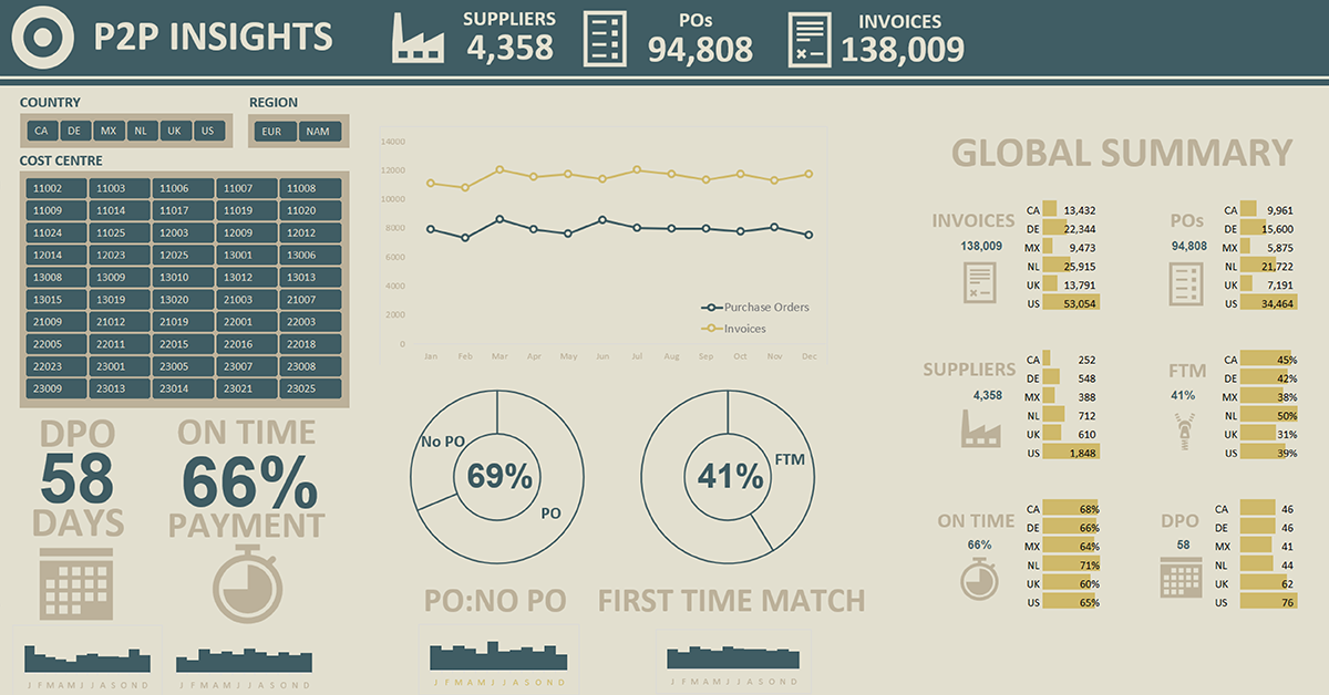
Purchase to Pay KPIs
I’ve seen many P2P KPI dashboards but I’ve seen very few that are useful. They try to address a mixed audience and then fall into the trap of trying to present too much data in a confusing way. It can be forgiven. Data visualization is not a core skill for most of us and Excel out of the box doesn’t help much.
Take a typical example. A business has implemented a comprehensive P2P system covering purchasing invoice management and payment. The list of KPIs can be enormous: number of catalogues, number of POs and PO lines, volumes of invoices and numbers that are electronic, amount spent, spend under management, AP productivity, compliance by department – the list goes on and on. All these measures are relevant but they are not all relevant to everyone. And neither are they insightful. What does the number of POs tell me about my Purchase to Pay maturity? Frankly – absolutely nothing. Does a rising number mean we are spending more? And if we are, is that because of growth? That could be a good thing. Or is it saying that spend is out of control? Which is a bad thing. On its own, without context, number of POs is a pointless piece of information.
On the other hand, tell me the ratio of POs to invoices – that will tell me the extent to which goods and services are being bought without a proper purchase order. It gives me an insight into the effectiveness of the P2P system that has been bought and the levels of acceptance of P2P processes. An improving trend says that the P2P system and processes are working. If it’s a negative trend, I want to know in which areas things are failing. This is a relevant measure that gets straight to the point and leaves me wanting more.
The No PO Invoice ratio is an insightful P2P KPIs. It is easy to collate from existing data and it’s easy to explain, And, to the right audience – to an audience that wants to understand P2P in their organisation – it is insightful and relevant.